Project Lockdown
Showcase website
Showcasing community craft worthy of a professional studio.
Brief & initial request
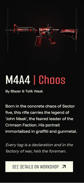
Project Lockdown is the work of a French collective of Counter-Strike enthusiasts. The website had to showcase two creations: a 3D cinematic paying tribute to the franchise, and a collection of skins designed for a fictional Counter-Strike 2 operation.
Beyond the tribute, the creators hope to see their work become part of the game’s official ecosystem. On release, the project was picked up by the specialist gaming press.
The visual world blends two influences: industrial aesthetics (mechanical textures, labels, signs of wear) and modern favelas, with graffiti-inspired patterns ranging from minimalist marks to sticker art. The challenge was to bring the two together, with a dark palette lifted by vivid colours and sharp, angular, dynamic linework.
- Year
- 2025
- Sector
- Video games
- Collaboration
- Bastien Tafforeau, full-stack developer
Involvement
- Analysis — step carried out
- Identity — step carried out
- Design — step carried out
- Integration — step carried out
- Follow-up — step out of scope
Identity
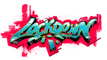
The logo was created by the client, following work we did together, particularly on the colours. It became the cornerstone of the identity: the palette, the typefaces and the site’s whole visual world all stem from it.
Logo
Favicon

Typefaces & colours
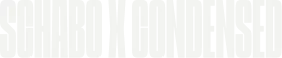
For headings, Schabo X Condensed brings the project’s raw, urban edge: a very distinctive typeface that commands attention at first glance. As a counterpoint, Smooch Sans, used for subheadings, is thin and angular, echoing the industrial, pared-back feel of this world.
The body copy deliberately uses a display typeface, Funnel Display: the site has few long texts, and its graphic details give it character without hindering readability.
The palette is deliberately restrained: a deep black, a cream white and a bright, saturated, almost incandescent pinkish red. Attention must stay on the collective’s creations; the site is only there to showcase them.
Headings
Subheadings

Body copy

Primary
#FE0041
Text
#F7FEE7
Background
#0A0A0A
Responsive
Choices & constraints
Showcasing without weighing things down
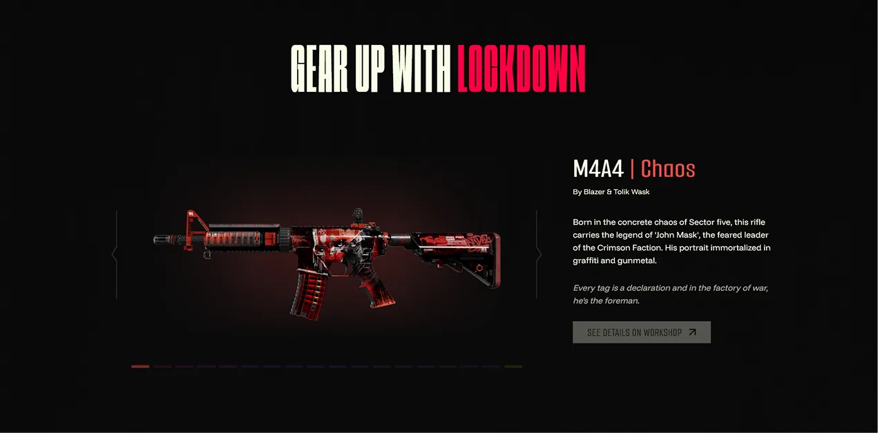
The site relies on rich visuals: a cinematic, videos and some twenty skin renders. To show them without weighing the page down, every image was resized to its actual display size and compressed to WebP, bringing the total image weight down from 9.5 MB to 1.7 MB. The homepage cinematic went from 32 MB to 4.4 MB, with a lighter version for phones.
A loading screen with a purpose
The loading screen does more than keep visitors waiting: while it animates, the page is built underneath and its images load. A still from the cinematic appears straight away, and the video starts as soon as the site is ready to explore.
Animations that serve the project
The animations, made with GSAP, extend the world of Project Lockdown: for example, smoke drifting across the skin carousel, or tags that write themselves under the creators’ names, as if on a wall.
Tech stack
This project was built with the Vue.js 3 framework, together with TypeScript to keep it maintainable over time. Most of the animations rely on GSAP (GreenSock Animation Platform), a JavaScript animation library.
Scope
I created the visual identity and the mockups. On the development side, I focused mainly on the animations: the loading screen, the smoke effect in the carousel, the tags under the contributors’ names, and so on.