Blog Kollori
Blog
A colourful site dedicated to office design and wellbeing at work.
Brief & initial request
Founded in 2012 and based in Boulogne-Billancourt, near Paris, Kollori sells design office furniture to businesses and helps them fit out their workspaces. Its blog explores trends in the world of work: office design, ergonomics, wellbeing at work.
The brand had just redesigned its visual identity and its online shop. The blog therefore needed updating to carry the same identity.
- Year
- 2024
- Sector
- E-commerce
Audit of the existing site
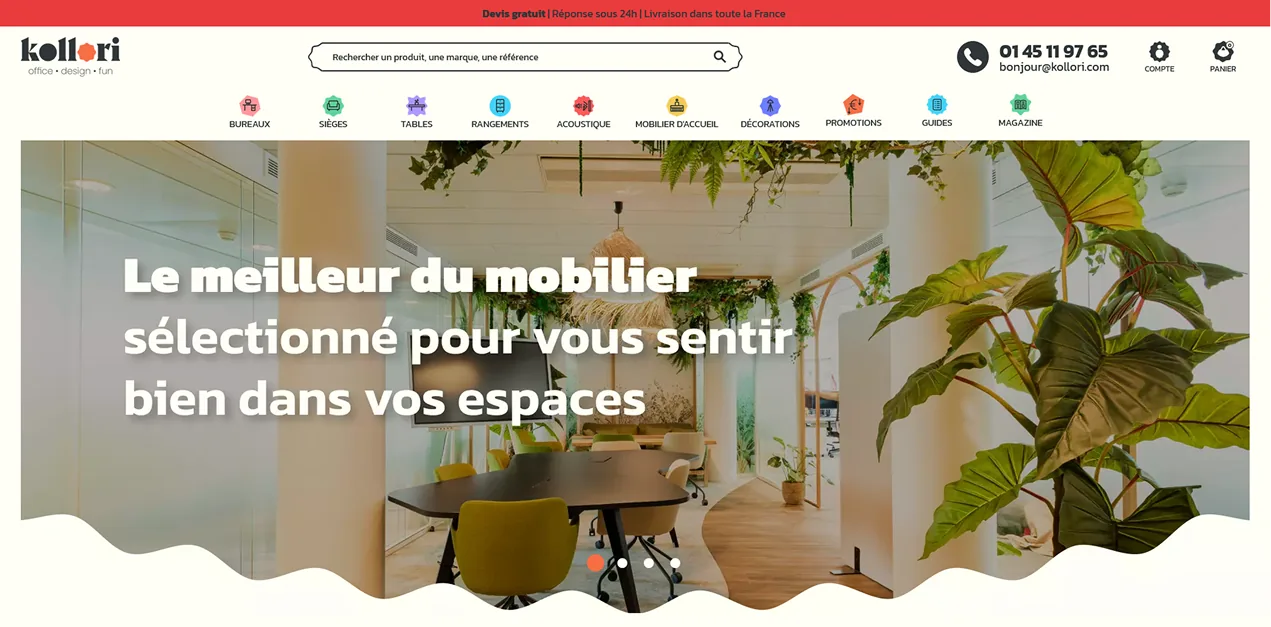
Kollori’s new identity was designed by Studio Aeria. The logo plays on the “O” in Kollori, into which shapes and colours slip: a way of saying that a workspace can be shaped and brought to life. The brand’s signature orange was kept.
The result is a modular, colourful identity, extended into a whole graphic world that illustrates the many ways to fit out an office. The blog had to find its place within this world.

Context
I carried out this project during my internship at Kollori, as part of my UI designer training course (2023–2024), working directly with the brand’s team. One technical constraint was set from the start: the blog had to stay on WordPress.
Before designing anything, I analysed the project:
- Technical analysis of the existing blog
- SEO analysis
- Benchmark of competing blogs
- Personas and experience map
Involvement
- Analysis — step carried out
- Identity — step out of scope
- Design — step carried out
- Integration — step carried out
- Follow-up — step out of scope
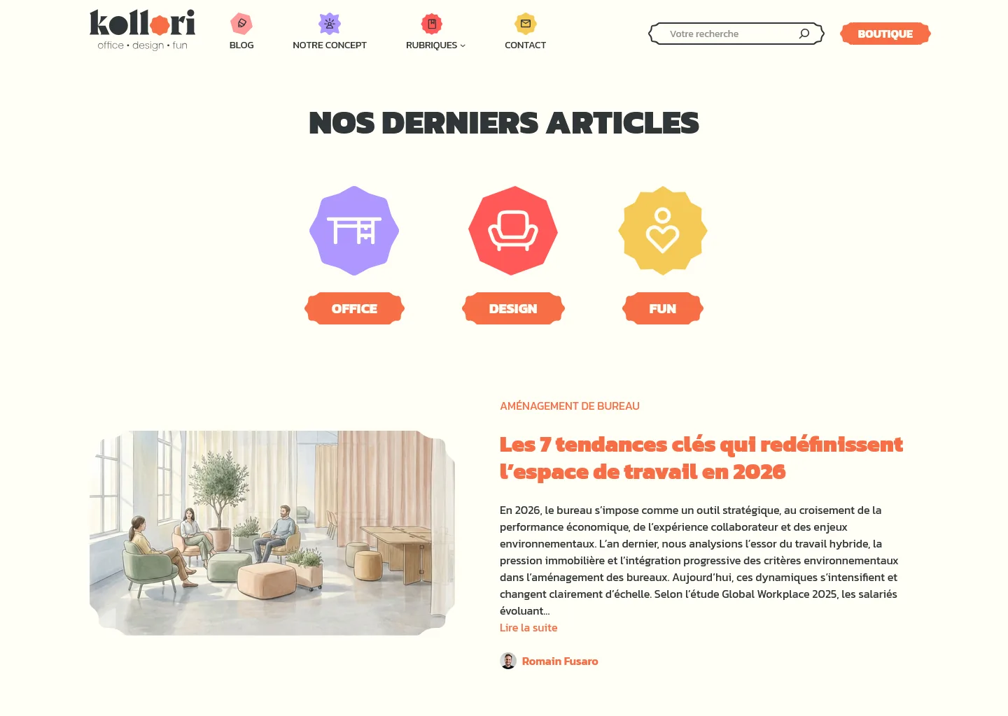
Wireframes & mockups
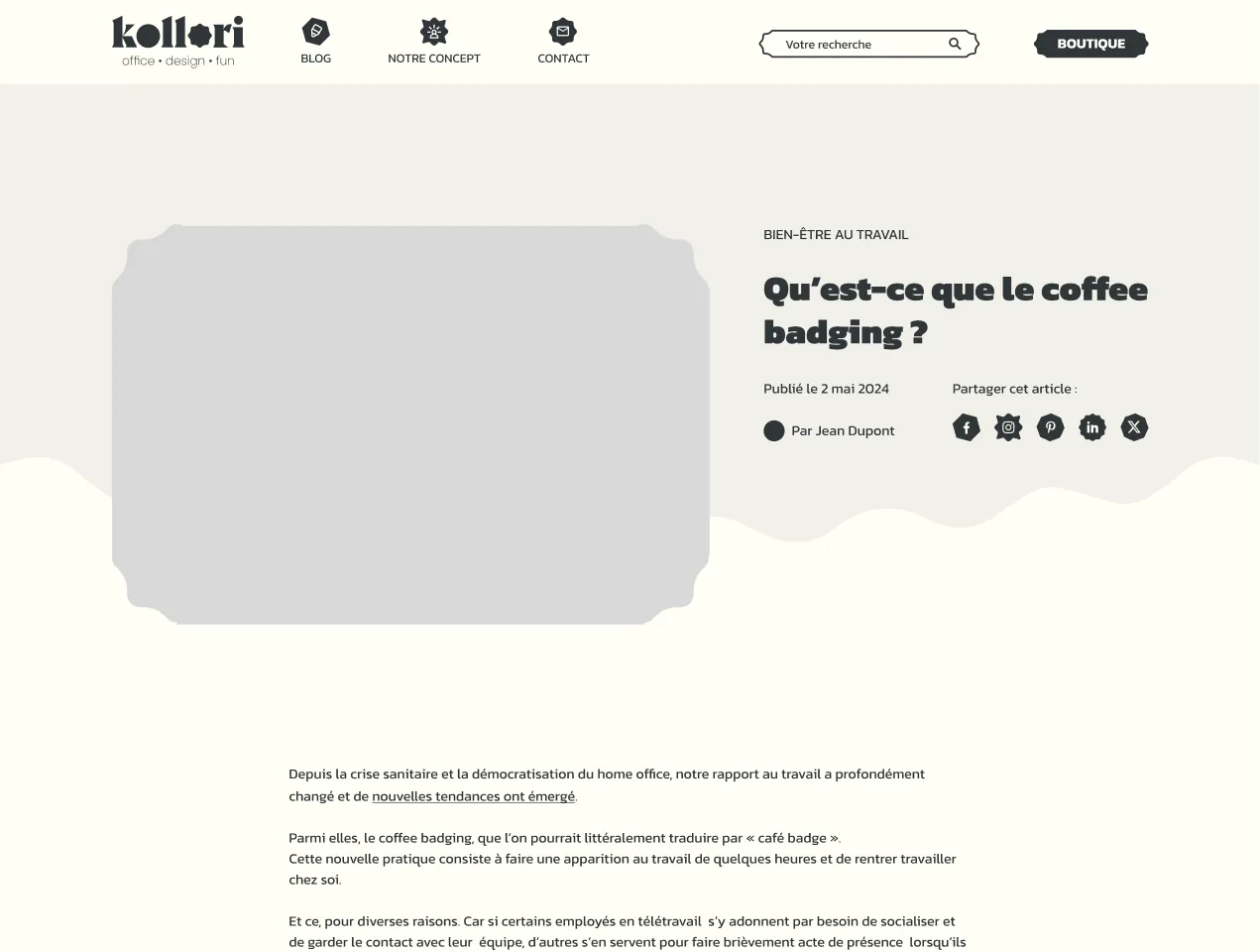
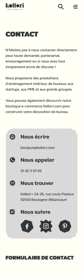
Wireframe
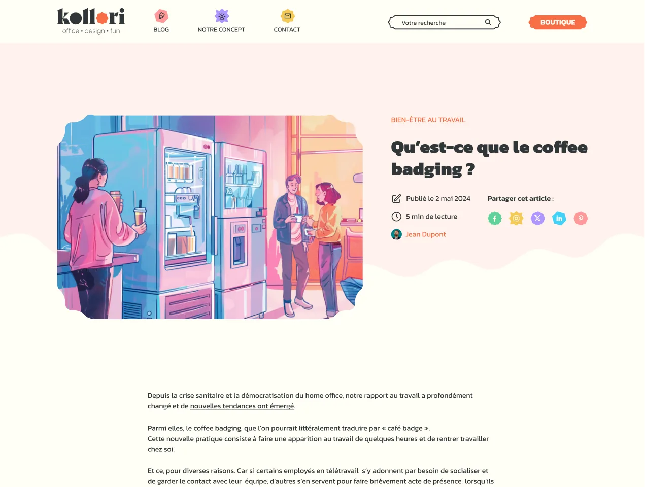
Mockup
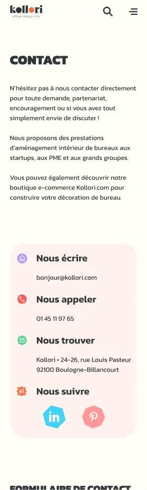
Components
Animation, idle and on hover/click
Responsive
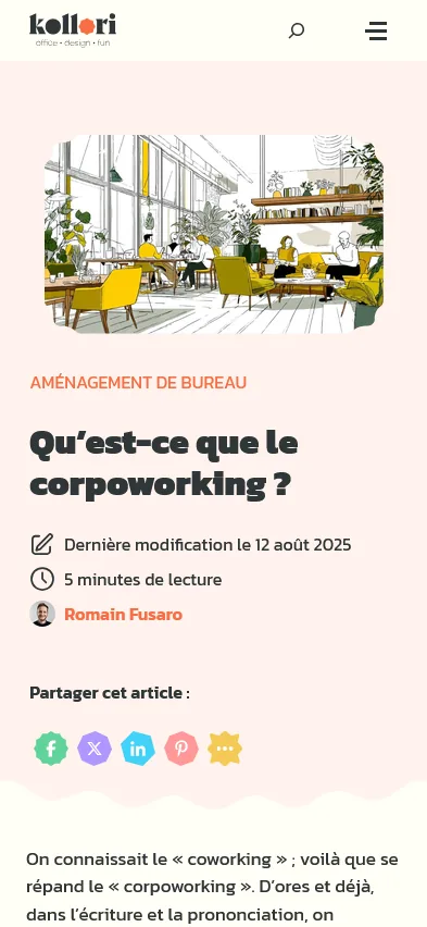
Choices & constraints
As few plugins as possible
The blog was built with WordPress, but I wanted to install as few plugins as possible to keep the site light and easy to maintain. The animations, such as the paper plane, are therefore written in CSS rather than handed over to a plugin.
In keeping with the identity
I wanted to stay as close as possible to the new identity: the blog’s own components (post cards, headers, animations…) were designed as an extension of this modular, colourful world, so that the blog and the shop speak with one voice.
Tech stack
The blog runs on WordPress (in PHP); the front end is written in plain HTML, CSS and JavaScript, with no framework.
Back office
The goal was for the Kollori team to be able to run the blog on their own. I therefore structured the back office with Custom Post Types and Advanced Custom Fields (ACF): each type of content has its own clear, guided fields, with no need to touch the code.
Scope
I did not create the visual identity, which was designed by Studio Aeria. I carried out the project analysis, designed the blog’s wireframes and mockups, then developed it on WordPress, back office included.